3. Data visualisation#
Data visualisation is an important skill for data scientists. In fact, data manipulation and visualisations go hand in hand. Before any analysis, it is important to visualise data to explore its distribution, relationships, normality, etc.
We will be working with matplotlib library within Python for data visualistion. Although there are many other packages, matplotlib is the foundational library. Thus it is important to master matplotlib first before exploring other advanced libraries. You can import matplotlib as follows. We will also need the pandas package to read data:
import matplotlib.pyplot as plt

import pandas as pd
We will be working with the gapminder dataset, which is the real world data. I have saved this data as a CSV (comma-separated values) file on GitHub. A CSV file is a text file used to store data in a tabular format. You will use .read_csv() function from pandas to read this file and assign it to gapminder:
gapminder = pd.read_csv("https://raw.githubusercontent.com/aubreympungose/data-science-course/main/weeks/data/gapminder.csv")

# Take a look at the first observation of the data
gapminder.head()
| country | continent | year | lifeExp | pop | gdpPercap | |
|---|---|---|---|---|---|---|
| 0 | Afghanistan | Asia | 1952 | 28.801 | 8425333 | 779.445314 |
| 1 | Afghanistan | Asia | 1957 | 30.332 | 9240934 | 820.853030 |
| 2 | Afghanistan | Asia | 1962 | 31.997 | 10267083 | 853.100710 |
| 3 | Afghanistan | Asia | 1967 | 34.020 | 11537966 | 836.197138 |
| 4 | Afghanistan | Asia | 1972 | 36.088 | 13079460 | 739.981106 |
We have loaded the dataset. You can see columns and rows.
gapminder.info()
<class 'pandas.core.frame.DataFrame'>
RangeIndex: 1704 entries, 0 to 1703
Data columns (total 6 columns):
 #   Column     Non-Null Count  Dtype
---  ------     --------------  -----
 0   country    1704 non-null   object
 1   continent  1704 non-null   object
 2   year       1704 non-null   int64
 3   lifeExp    1704 non-null   float64
 4   pop        1704 non-null   int64
 5   gdpPercap  1704 non-null   float64
dtypes: float64(2), int64(2), object(2)
memory usage: 80.0+ KB
We can see that gapminder has 6 columns and 1704 rows. The columns in the dataset are:
country: Simply the country
continent: Continent
year: The year data was collected
lifeExp: Life expectancy of a country in year
pop: Population of the country in a year
gdpPercap: Gross Domestic Product of a country in a year
It is a time series data that track countries. Look at the range of years:
print(gapminder["year"].min())

print(gapminder["year"].max())
1952
2007
The datasets contain observations collected from 1952 to 2007.
3.1. A first plot#
Suppose you want to show relationship between life expectancy and GDP per capita. We can create a scatterplot:
plt.scatter(x = gapminder["gdpPercap"], y = gapminder["lifeExp"])

plt.show()
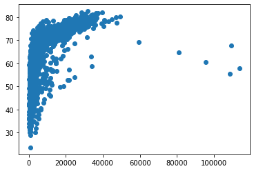
We have created a first plot. Let examine the code above:
We used
scatter()function from pylot sub-package of matplotlibWe specified that we need the to plot two columns:
gdpPercapon x-axis andlifeExpon the y-axis.We then used
.show()function from pyplot to show the plot.
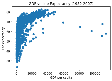
3.2. Labels#
Notice that our first plot does not have any labels on the both axis, and also does not have a title. We can add all of these:
plt.scatter(x = gapminder["gdpPercap"], y = gapminder["lifeExp"])

# Set x-axis labels
plt.xlabel('GDP per capita')

# Set y-axis
plt.ylabel('Life expectancy')

# set title of the plot
plt.title('GDP vs Life Expectancy (1952-2007)')

# show the plot

plt.show()
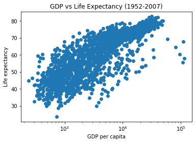
3.2.1. Transforming axis scales#
Notice that x-axis is not normally distributed. One of the method to use is to transform data to log10, to normnalise it:
plt.scatter(x = gapminder["gdpPercap"], y = gapminder["lifeExp"])

plt.xlabel('GDP per capita')

plt.ylabel('Life expectancy')

plt.title('GDP vs Life Expectancy (1952-2007)')

# Apply log scale to x-axis
plt.xscale('log')


plt.show()
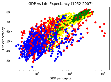
3.2.2. Customise: colour, size, shape#
Sometimes you may need to change how variables/data point appear. Suppose you want to make all the countries belonging to each continent to be of same colour. Here, you would need to create a dictionary where each continent name is a key and colour as a value, then create a plot
colour_dict = {
    'Asia':'red',
    'Europe':'green',
    'Africa':'blue',
    'Americas':'yellow',
    'Oceania':'black'
}

colors = [colour_dict[continent] for continent in gapminder['continent']]

plt.scatter(gapminder['gdpPercap'], gapminder['lifeExp'], c=colors)

plt.xlabel('GDP per capita')

plt.ylabel('Life expectancy')

plt.title('GDP vs Life Expectancy (1952-2007)')

plt.xscale('log')


plt.show()