3 Data Visualisation
Before We Begin
Base R vs External Packages
Until now, we have used functions within Base R, which are already installed in R. While Base/bulit-in R functions are important, however, in many cases, we want to use external packages to do any task we want. This also applies in other programming languages like Python. For example, if we want to do spatial and GIS analysis, we can install the sf package; for machine learning, we can use caret and tidymodels packages. There are over 2 000 R packages, contributed by different individuals around the world, and they are stored and curated in the CRAN website. In most of the cases, you will be working with external packages.
One of the most popular packages in R is the tidyverse meta-package, which include a collection of packages for working with data; some of packages in the tidyverse are:
dplyr: for data cleaning, wrangling and transformationggplot2: for data visualisationtidyr: for tidying up datareadr: for importing datapurrr: for advanced functional programmingstringr: for manipulating string/text data
There are other packages in the tidyverse. The philosophy of tidyverse is tidy data:
- Each variable is a column; each column is a variable.
- Each observation is row; each row is an observation.
- Each value is a cell; each cell is a single value. [@r_4_ds]
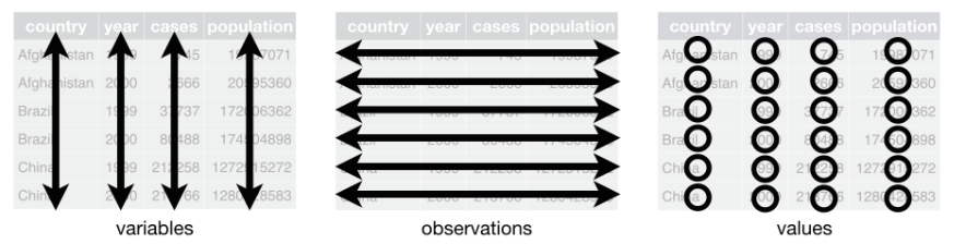
Tidy data is a principle we are going to stick on through this course:
So all in all, tidyverse make it easier to work with dataframes and most people prefer it than base R functions. We will use an example at the end to understand the differences between Base R and tydiverse. You will need to install the package first. In R you install a package by calling install.package() function:
Whenever you need to use an external package and its functions, you first need to load it using library() function. In our case, we want to load the tidyverse package we have just installed:
── Attaching packages ─────────────────────────────────────── tidyverse 1.3.2 ──
✔ ggplot2 3.4.1     ✔ purrr   1.0.1
✔ tibble  3.1.8     ✔ dplyr   1.1.0
✔ tidyr   1.3.0     ✔ stringr 1.5.0
✔ readr   2.1.4     ✔ forcats 1.0.0
── Conflicts ────────────────────────────────────────── tidyverse_conflicts() ──
✖ dplyr::filter() masks stats::filter()
✖ dplyr::lag()    masks stats::lag()
You will load other packages like this.
3.1 Introduction to data visualisation
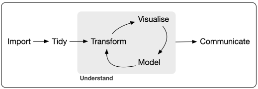
Data visualisation is an important skill for data scientists. In fact, data manipulation and visualisations go hand in hand. Before any analysis, it is important to visualise data to explore its distribution, relationships, normality, etc.
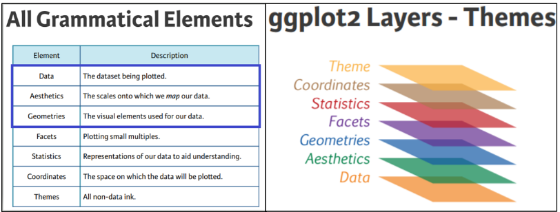
In this section, we will use the ggplot2 package within tidyverse to learn the foundations of data visualisation. The ggplot2 package got it philosophy from the book The Grammar of Graphics, written by Leland Wilkinson. The ggplot2 package was developed by Hadley Wickham, probably one of the most greatest data scientist in this era.
We will be working with the gapminder dataset, which is the real world data. You will need to install its first because it comes as a package:
After installing the gapminder data, you will have to load it using library function:
Remember that we said everything we create is an object and we need to assign it? Let us assign gapminder that and name simply as gapminder using the <- operator:
Explore the data first; how many columns and rows are in gapminder dataframe? We will use str() function:
tibble [1,704 × 6] (S3: tbl_df/tbl/data.frame)
 $ country  : Factor w/ 142 levels "Afghanistan",..: 1 1 1 1 1 1 1 1 1 1 ...
 $ continent: Factor w/ 5 levels "Africa","Americas",..: 3 3 3 3 3 3 3 3 3 3 ...
 $ year     : int [1:1704] 1952 1957 1962 1967 1972 1977 1982 1987 1992 1997 ...
 $ lifeExp  : num [1:1704] 28.8 30.3 32 34 36.1 ...
 $ pop      : int [1:1704] 8425333 9240934 10267083 11537966 13079460 14880372 12881816 13867957 16317921 22227415 ...
 $ gdpPercap: num [1:1704] 779 821 853 836 740 ...
We can see that gapminder has 6 and 1704. The columns in the dataset are:
country: Simply the country
continent: Continent
year: The year data was collected
lifeExp: Life expectancy of a country in year
pop: Population of the country in a year
gdpPercap: Gross Domestic Product of a country in a year
ggplot2 has steps/processes you follow to create a plot. Let us illustrate using the gapminder dataset. Load ggplot2 package first:
A plot created in using ggplot2 has the following components/layers, and we will go through them step-by-step:
3.2 Create a plot
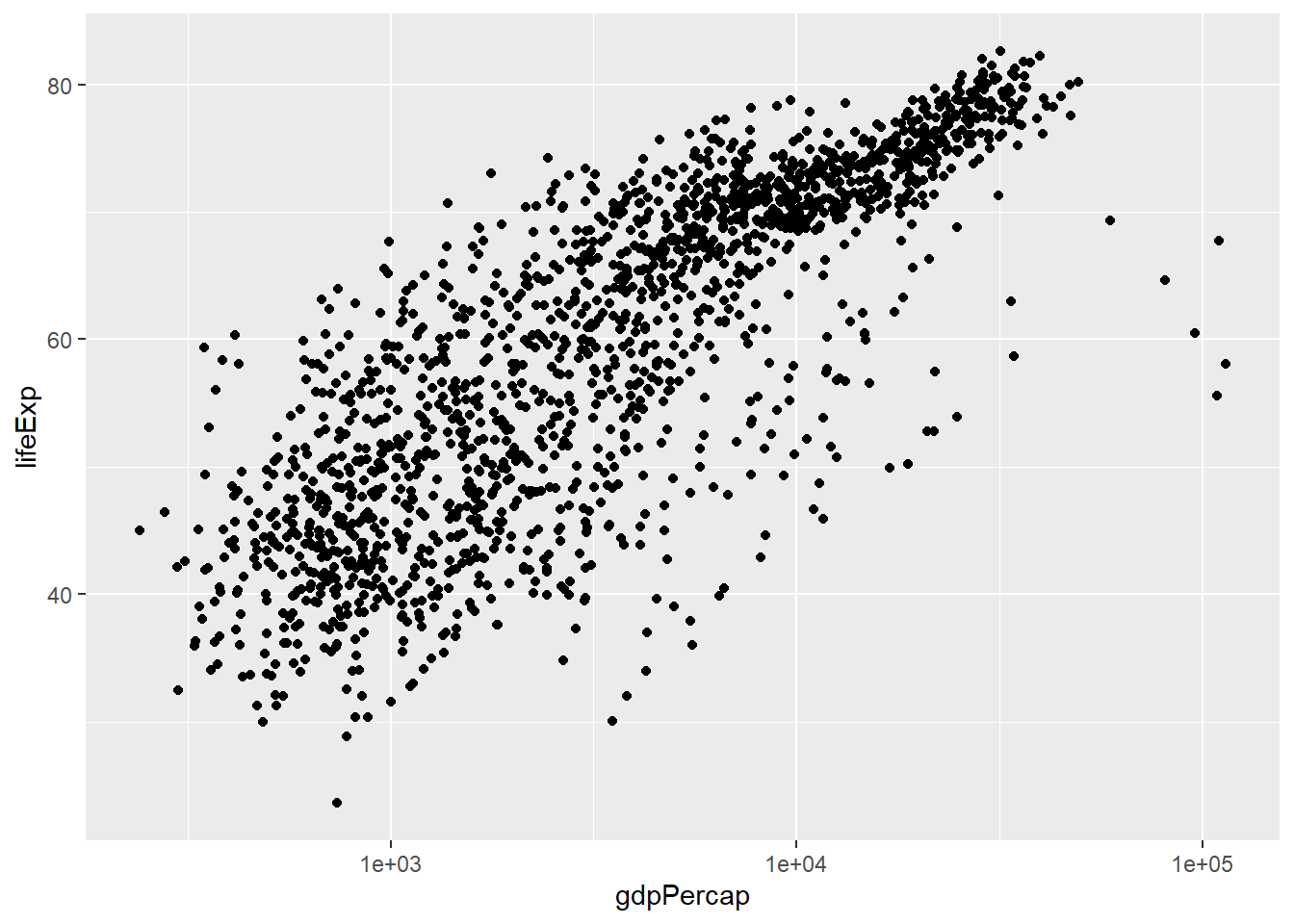
From the ggapminder dataframe, we will create a scatterplot of life expectancy and GDP per capita, and add all the components of ggplot step-by-step.
3.2.1 Layer 1: data
We use the ggplot() function to add data, in this case, gapminder dataframe:

3.2.2 Layer 2: aesthetics
Aesthetics are used to allocate x and y variables, depending on the type of the plot we want to create, in this case, x variable is gdpPercap and y variable is lifeExp:
There are other aesthetics that we can add, such as size, colour, shape, group, etc. We will use these later in this section.
3.2.3 Layer 3: geometry
Geometry is the type of plot/object we want to create. In our casewe want to create a scatterplot, by using geom_point() function:
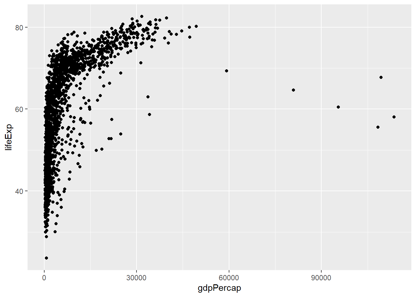
We now have our first plot. There other geometry types in ggplot depending on the type of data you have
geom_point(): for sactterplotsgeom_line(): for line plotsgeom_histogram(): for histogramgeom_area(): for area chartsgeom_boxplot(): for boxplotsgeom_bar(): for bar graphs
In the code above, we have three steps to create a plot:
ggplot(data = gapminder): we are simply telling ggplot that we are using gapminder datasetggplot(data = gapminder, aes(x = gdpPercap, y = lifeExp)): we are adding mapping aesthetics or aesthetics, allocating x, y axis.ggplot(data = gapminder, aes(x = gdpPercap, y = lifeExp)) + geom_point(): We have added a geometry layer throughgeoms_point()function to create a scatterplot.
3.2.4 Layer 4: Labels
ggplot2 package can handle various plot labels, including axis titles and graph titles. We can do this using labs() function:
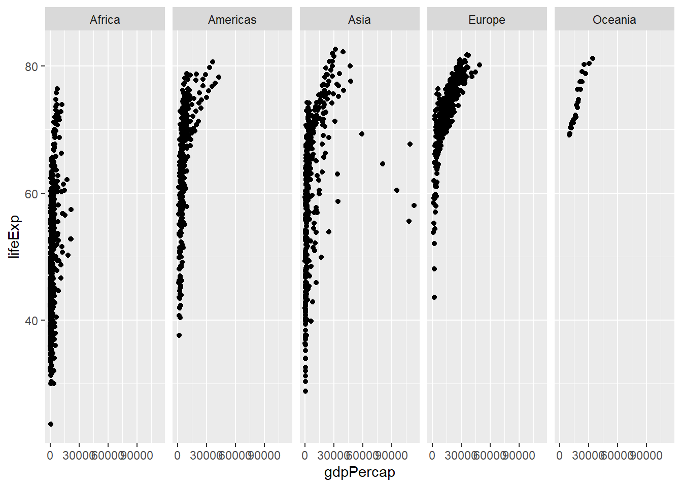
3.2.5 Facets
Faceting is used when we’d like to split a particular visualization by the values of another variable. This will create multiple copies of the same type of plot with matching x and y axes, but whose content will differ.
When we one to split the plots into various sub-categories, by using a categorical variable, we use facet_wrap() function. For example, we may want to split the above plot by continent:
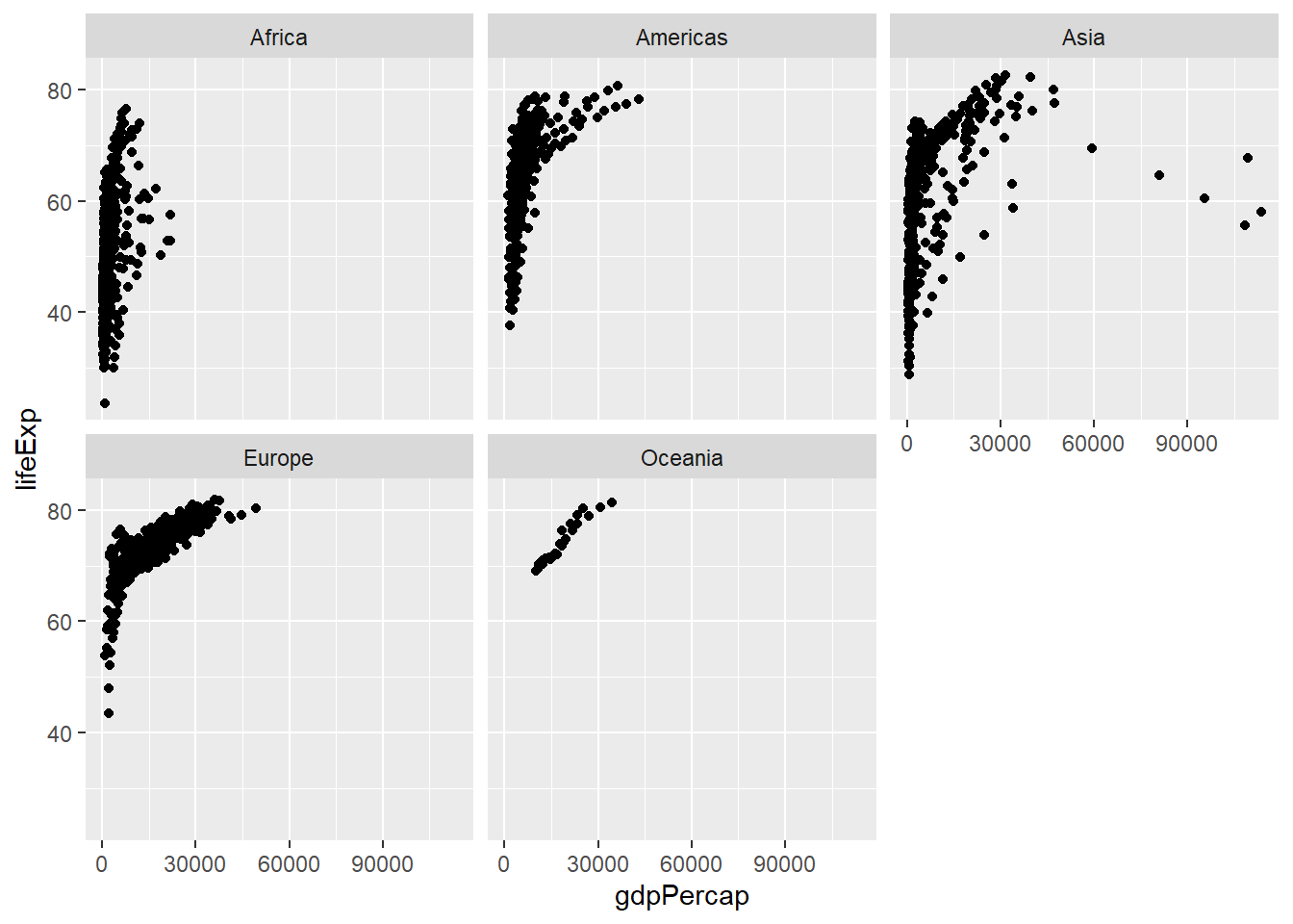
There are other argument that comes with facet_wrap() function. We can specify tghe number of rows and columns, using nrow() and ncol() functions, respectively.
3.2.6 Transforming axis scales
Notice that x-axis is not normally distributed. One of the method to use is to transform data to log10, to normnalise it:
Look how it changes.
There are many scales functions and you will learn them along the way by coding and exploring ggplot.
3.2.7 Returning to aeathetics
We can add other aesthetics in our plot, for example, we can allocate colour to the continent column:
ggplot(data = gapminder,
    aes(x = gdpPercap, y = lifeExp, colour = continent)) +
    geom_point() +
  scale_x_log10()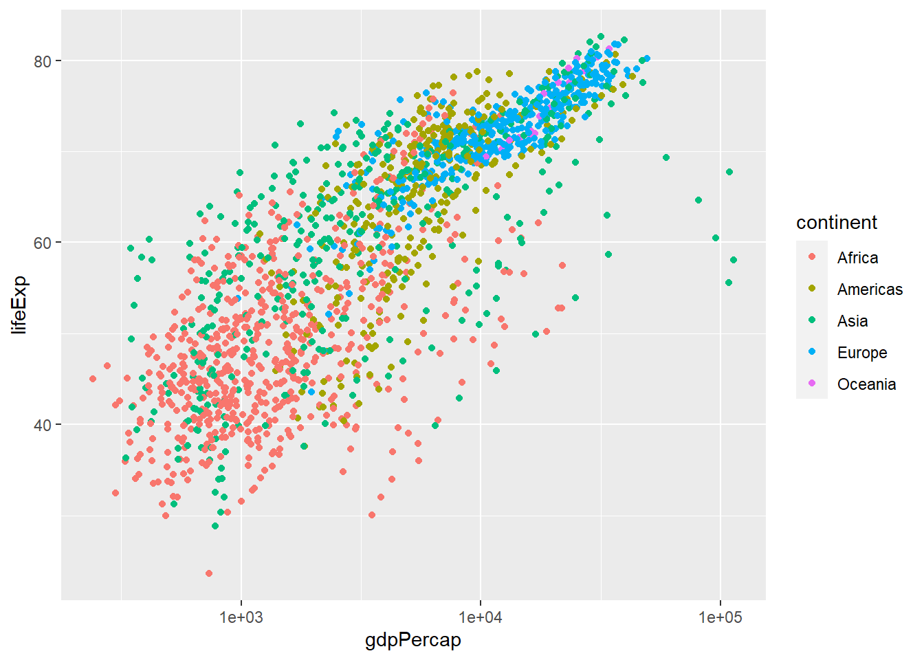
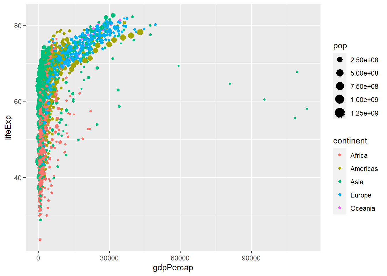
Notice how countries in Europe tend to have higher GDP per capita and and higher life expectancy compared to African countries.
We can also change the shape of points in the aesthetics:
ggplot(data = gapminder,
    aes(x = gdpPercap, y = lifeExp, colour = continent, shape = continent)) +
    geom_point() +
  scale_x_log10()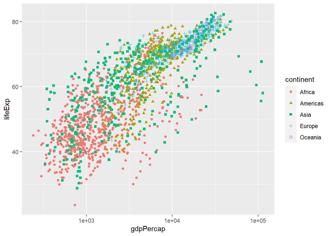
There are many other aesthetics arguments that are used and they are beyond the scope of this course. It takes practice.
3.2.8 Themes
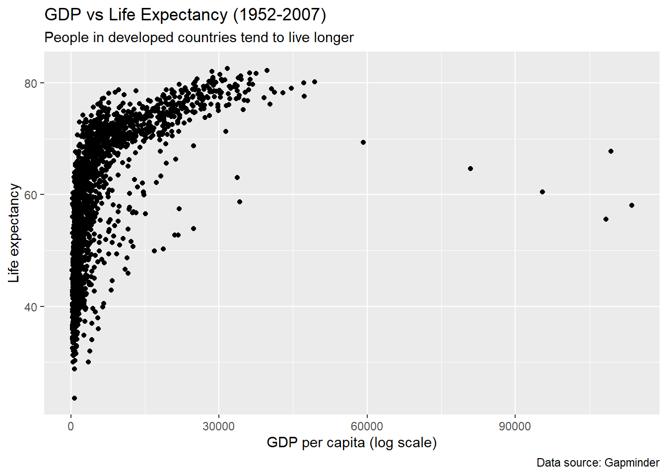
Try experimenting with different themes that comes with ggplot. theme_minimal() will produce a minimalist theme with less background:
ggplot(data = gapminder,
       aes(x = gdpPercap, y = lifeExp, colour = continent)) +
  geom_point() +
  scale_x_log10() +
  labs(x = "GDP per capita (log scale)",
       y = "Life expectancy",
       title = "GDP vs Life Expectancy (1952-2007)",
       subtitle = "People in developed countries tend to live longer",
       caption = "Data source: Gapminder") +
  theme_minimal()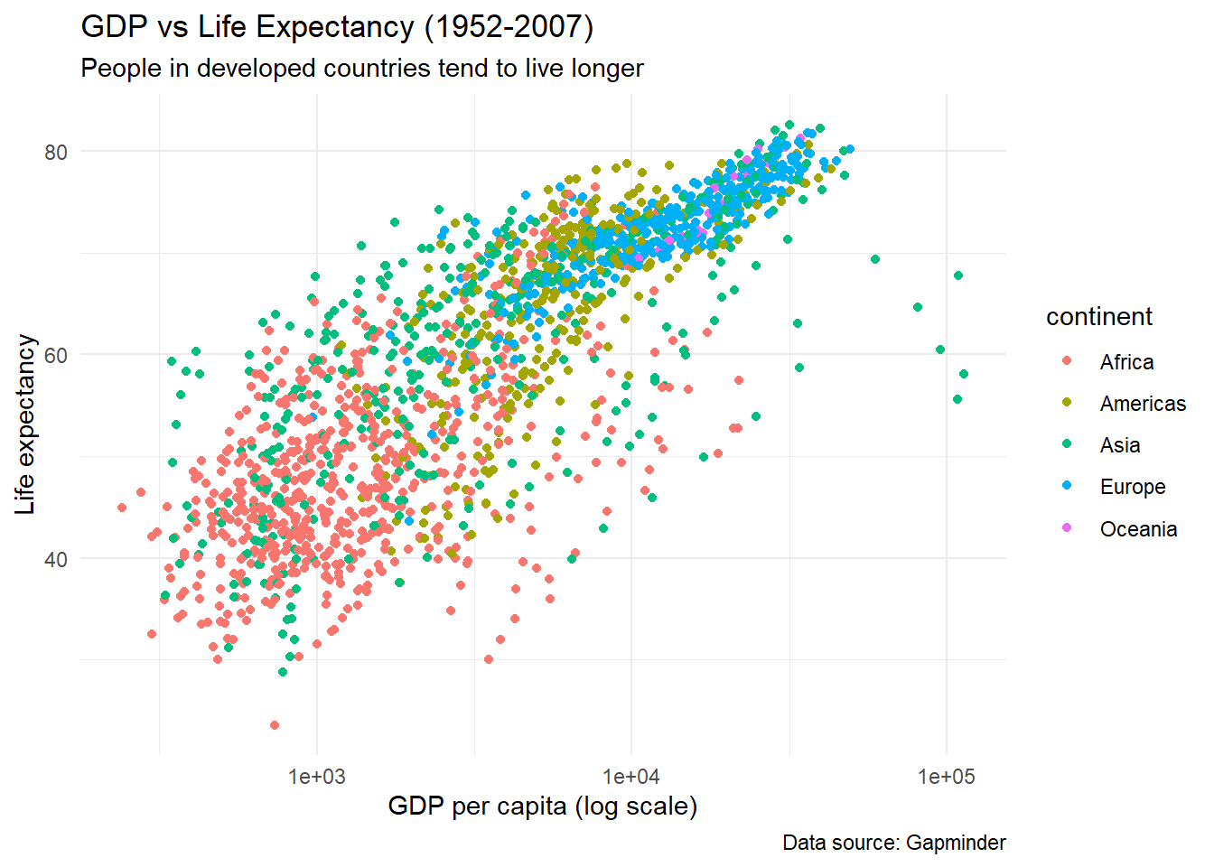
There are other themes that can transform your plots to look more elegant.
You can also choose the how fonts appear using themes() function:
ggplot(data = gapminder,
       aes(x = gdpPercap, y = lifeExp, colour = continent)) +
  geom_point() +
  scale_x_log10() +
  labs(x = "GDP per capita (log scale)",
       y = "Life expectancy",
       title = "GDP vs Life Expectancy (1952-2007)",
       subtitle = "People in developed countries tend to live longer",
       caption = "Data source: Gapminder") +
  theme(text = element_text(size = 15))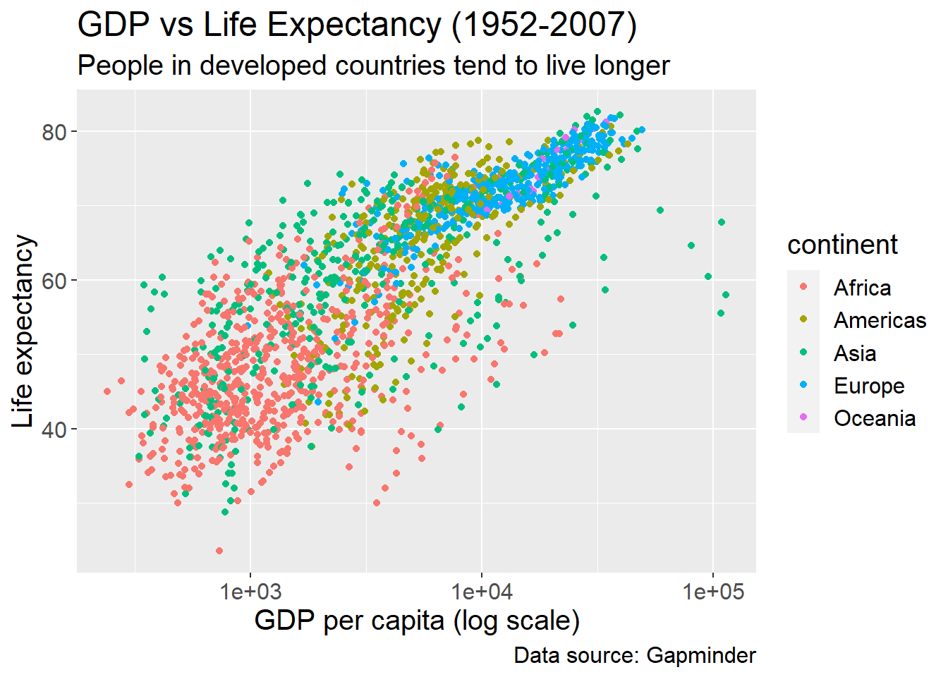
With themes() function, you can remove borders, change the colour of fonts, remove the legend, etc.
3.3 Visualising Numerical data
3.3.1 Single variable
For visualising one variable, we mostly histogram, density plot, etc:
Create a histogram of GDP per capita:
`stat_bin()` using `bins = 30`. Pick better value with `binwidth`.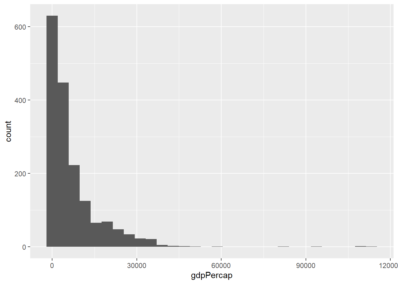
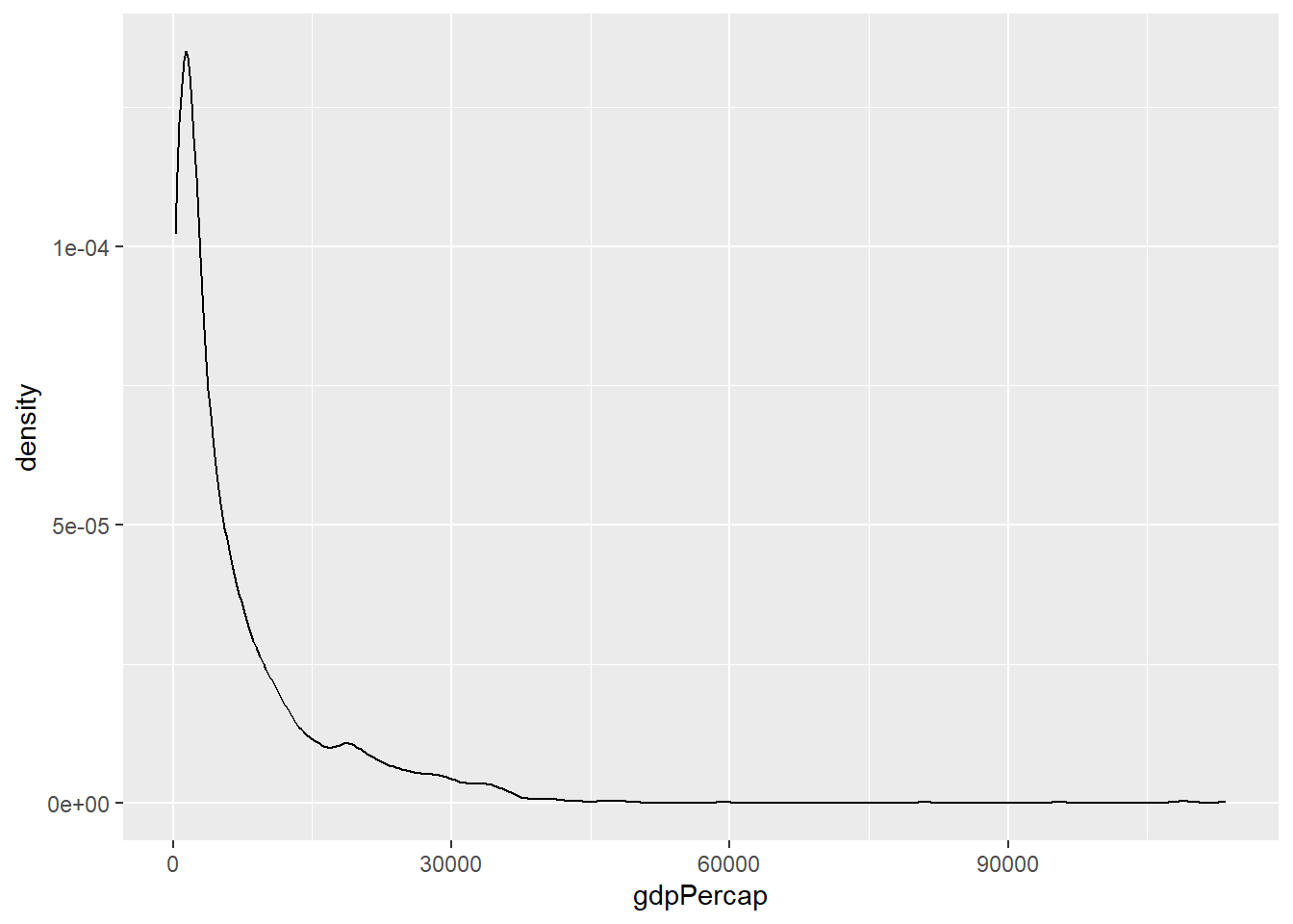
We can see that the GDP per capita variable is skewed. Density plots are also similar to histograms:
3.3.2 Visualising more than one numerical variables
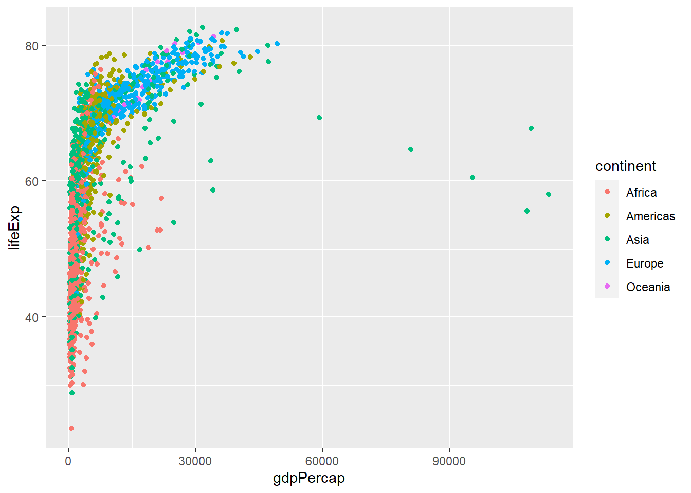
A scatter plot is used to show relationship between two variables

We can add other aeasthetics such as shape, colour etc: Let’s add the colour aesthetics:
We can change the add the size aesthetics and use population of the country:
3.3.3 Visualising numerical by group/category
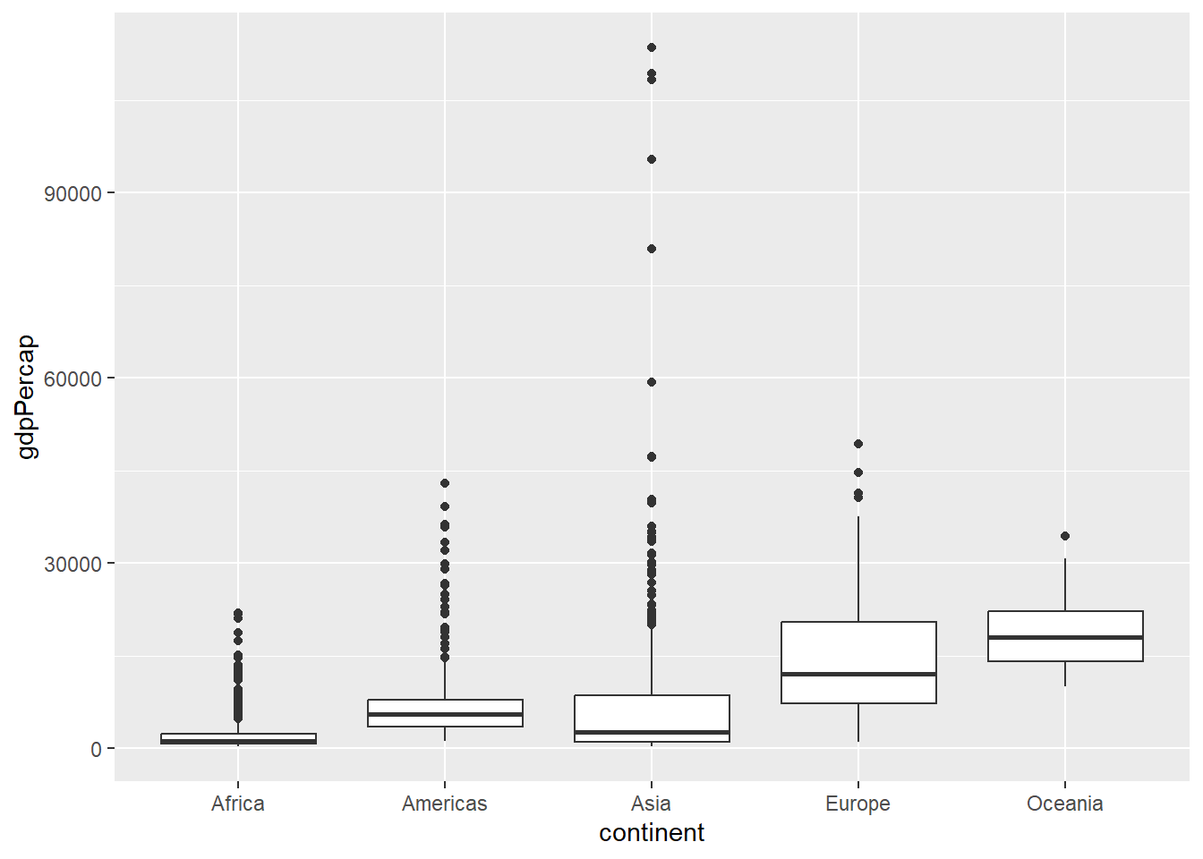
A boxplot is useful when we want to view statistics by a particular group, let say, GDP by continent:
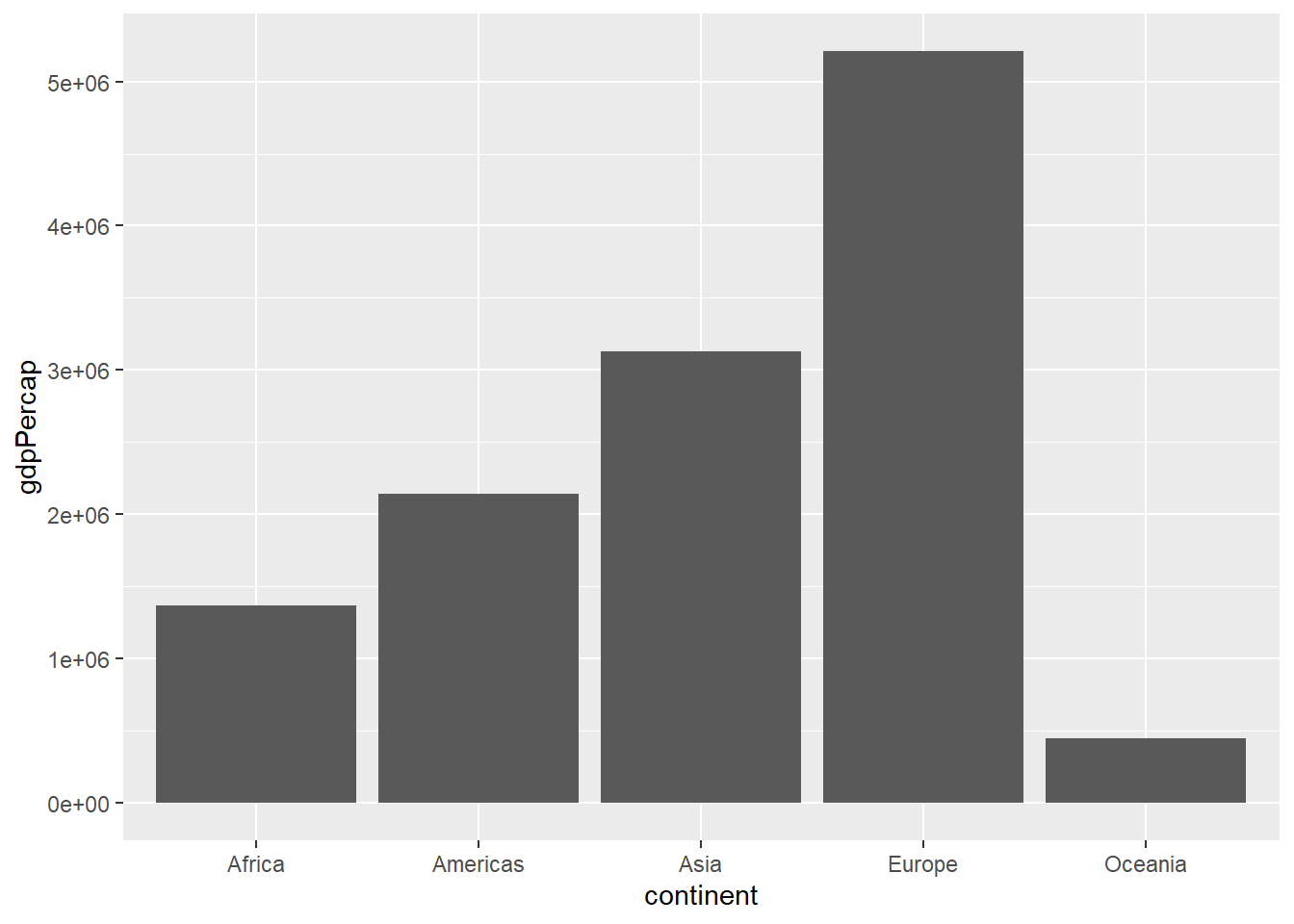
We can also use a column chart, let say, view GDP per capita by continent:
3.3.4 visualise trends
We mainly use line graphs to visualise statistics over time. Let use see how life expectancy changes over time
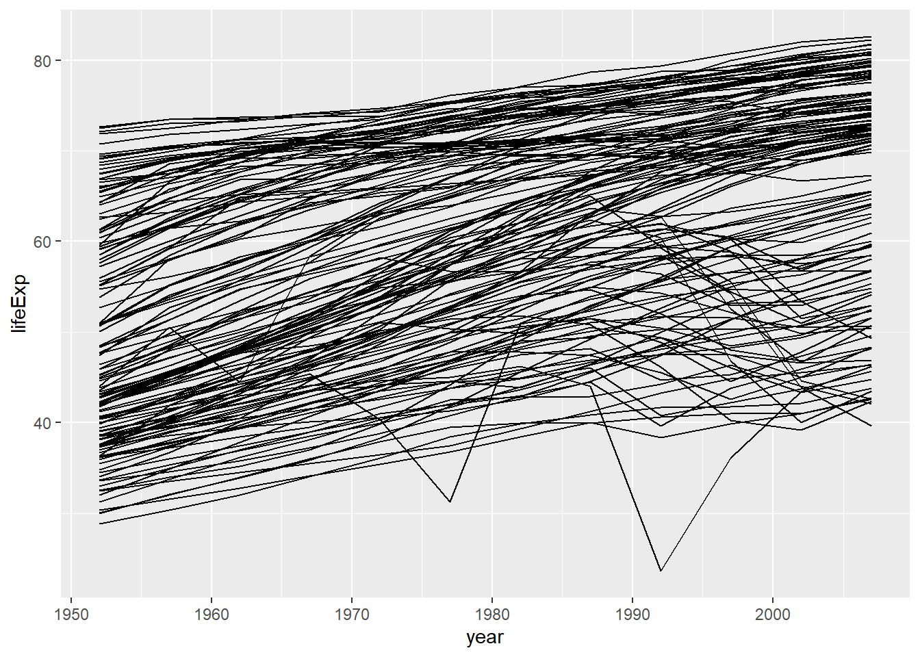
This looks ugly, but we will learn how to create proper line plots at the end.
You can also use stacked column chart:
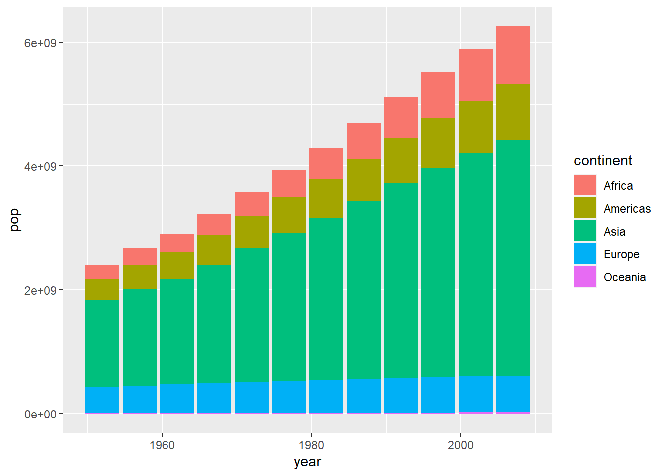
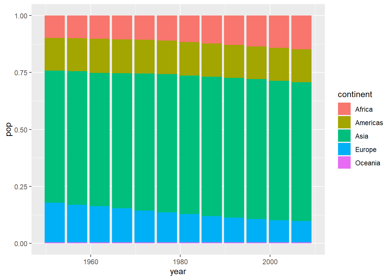
View by continent and make it 100% stacked bar
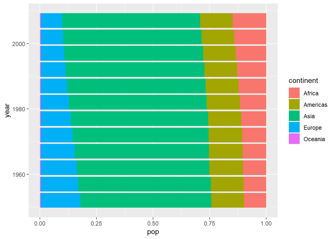
You can make horizontal bars by using coord_flip():
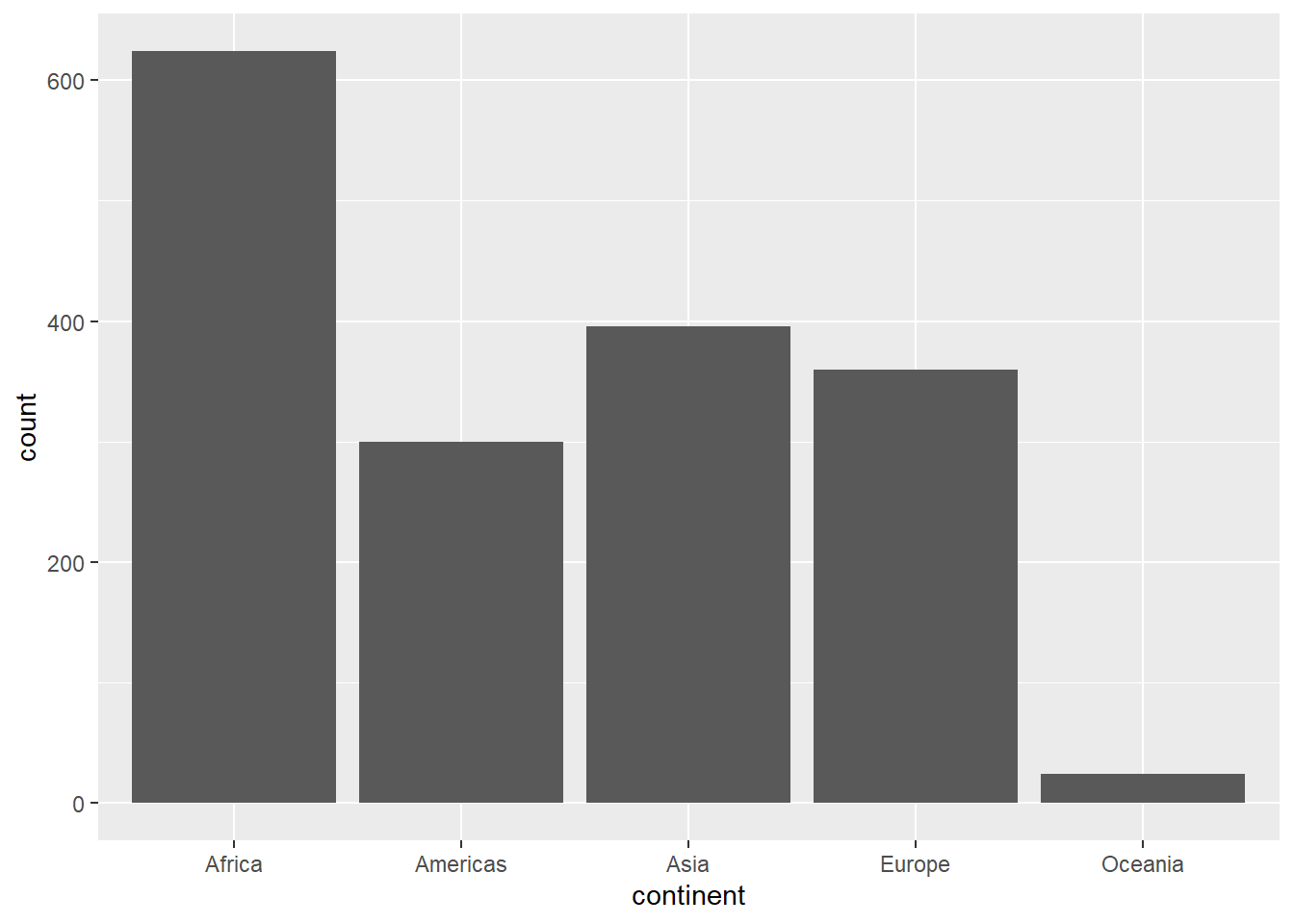
3.4 Visualising categorical/character data
In the gapminder dataset, we have two categorical columns: country and continent. One of the plot used for handling categorical data is bar chart. In ggplot, we use geom_bar:
Bonus one: Interactive charts
You can make your charts interactive by using plotly package, you will need to install it first
Then load the package:
Attaching package: 'plotly'The following object is masked from 'package:ggplot2':
last_plotThe following object is masked from 'package:stats':
filterThe following object is masked from 'package:graphics':
layoutFirst, create a plot using ggplot() and save it using the <- operator:
first_plot <- ggplot(data = gapminder,
       aes(x = gdpPercap, y = lifeExp, colour = continent)) +
  geom_point() +
  scale_x_log10() +
  labs(x = "GDP per capita (log scale)",
       y = "Life expectancy",
       title = "GDP vs Life Expectancy (1952-2007)",
       subtitle = "People in developed countries tend to live longer",
       caption = "Data source: Gapminder") +
  theme_minimal()
We named the plot first_plot. From the plotly package, you going to use ggplotly() function and put the plot object you have created:
Experiment with the results, when you hoover around the plot, you can see it shows information by variable. You can select which continent to make visible by clicking on the legend. Beautiful!
Bonus Two: Animate
You can create an animated chart using the gganimate package. Install first:
Load the package:
You would want to see how the life expectancy and gdp per capita changes over time. First create the plot, but add few functions:
animated_plot <- ggplot(data = gapminder,
       aes(x = gdpPercap,
           y = lifeExp,
           size = pop,
           colour = continent)) +
  geom_point() +
  scale_x_log10() +
  labs(x = "GDP per capita (log scale)",
       y = "Life expectancy",
       title = "GDP vs Life Expectancy (1952-2007)",
       subtitle = 'Year: {frame_time}',
       caption = "Data source: Gapminder") +
  theme_minimal() +
  transition_time(year) +
  ease_aes('linear')


animate(animated_plot)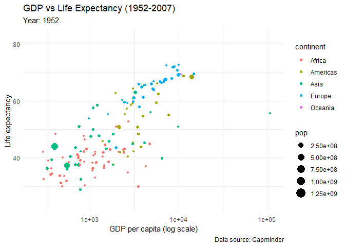
Look at the results!
This section introduced you to basics of data visualisation using ggplot2 package. You may need to consult the following materials for intermediate and advanced skills in data visualisation: